I made this print for someone who was looking for a personal wedding gift to give to her newly married friends. She had read the poem, Bouquet by Bei Dao, at their wedding, and wanted to commemorate the sentiment. She had asked me to design the the layout of the text to look sort of woodcut and loose, but because the poem is so long and reads in a way that encourages visuals within each line, I thought it better to individualize each line in an immediate way that set each apart, setting the type cleanly and varying size. The poem was screenprinted in 3 different colors and paper types, leaving her with a decision to make!
Tuesday, May 10, 2011
Monday, May 2, 2011
ANDY WARHOL ZOMBIE
Every semester I have my LMU screenprinting students participate in a print exchange. They decide on a theme and consistent size and each person works on a print they would have to exchange with all of the other students. This semester's theme? Monster/zombie/robot portraits. So I did the grandfather of screenprint--Andy Warhol. The funky red background was done using a color test screen!
Wednesday, April 27, 2011
SUPERFANCIES
| "EAT" |
| "Butter Kiss" |
| "Reverse Consumption" |
| "XO" |
| "The Last Sandwich" |
| "Stop Doing What You're Doing" |
| "Take Me Home Tonight" |
| Superfancies portfolio box |
| Printing in Matt's Old Town Pasadena studio, provided for him through The Armory Art Center's Artist in Residence Program from Feb. 5-June 5, 2011. |
| Matt signing his prints |
When I first met with Matt to talk about the possibilities of translating his work through print, I could see that painting film positives for screenprintnig would be a perfect compliment to his method of working. Matt hand painted individual color layers with black gesso on mylar, giving the printed versions a nice painterly less-than-perfect look that was really refreshing, compared to the other tightly registered work I had been working through.
Along with some additional wood type letterpress elements, the food and text themed suite turned out to be a coyly satiric and sentimental set of prints. It was a total joy to print.
The edition 15 can be purchased for an extremely reasonable price of $150 through CANAL!
Wednesday, March 23, 2011
Kaczmarek/Davis Wedding Invitations
These invitations were made for a wedding held in Poland. I was excited to see how the typeface would letterpress with it's Polish accent marks. The clean lines and simplicity really exploit the best of letterpress' attributes. I'm really happy with the way these invitations turned out.
With only 20 printed of each, these photopolymer plate printed, gray on white Crane's Lettra invitations feel like individually set letters to their loved ones.
Thursday, February 10, 2011
Banquet of The Black Jackal
This book was made to accompany a show held in Cal State LA's Luckman Gallery, this past January. Banquet of the Black Jackal was curated by artist Adam D. Miller, who likes to include similar zines alongside his curatorial projects. For this specific show, Miller partnered with designer Hazel Mandujano to plan the catalog; making it work closer to an artist book rather than the usual DIY look of a standard zine. To help polish the look, Hazel asked if I would print the covers, which was a total pleasure. The show included artists Liz Craft, Eduardo Consuegra, Matthew Greene, Shio Kusaka, Adam D. Miller, Ruby Neri, Devon Oder and Amando Ross Ho. The book and show look great!
| the front cover |
| The back cover |
All 250 covers are made up of a 6 run screenprint on davey board.
Tuesday, February 8, 2011
Thursday, December 30, 2010
New Sunburn Edition
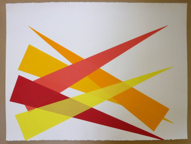
The above are prints from a variable edition I just finished up for Emily Joyce. All 28- 19" x 19" prints have individual ink and paper combinations.
Monday, November 22, 2010
Ana's Wedding Invitation
Wednesday, November 3, 2010
Anniversary Gift
Here is a look at a print I did for someone looking for a custom anniversary gift for her friends. Together we came up with the layout of screenprinted motifs, that reference the couple's wedding invitation, and letterpressed lyrics to the song At Last--the song she had sung for them at their wedding. The print is 11" x 15".
Tuesday, November 2, 2010
more SUNBURNS
Here are a new color versions of Emily Joyce's Sunburn prints, as mentioned before in the post "Sunburn". As you can see, we have a new intern in tow, former Tamarind Alum, Myungwon Kim! She just moved here to Southern California from Philadelphia. Could there a better way to become introduced to the Los Angeles art-making scene, than through the sunny-disposition of Emily's prints?
| Myungwon helping clean the screens |
| My color match samples were flower-shaped! |
Here are some of the AP's pulled while printing:
And the Final:
![]() |
| A similar version printed previously |
Subscribe to:
Posts (Atom)